- Client: Herbaland Naturals Inc.
- Role: Marketing Director / Creative Director
- Target Audience: Health-conscious consumer (2+)
- Sector: Business to Consumers (B2C)
- Task: Packaging & Logo Redsign
- Duration: 11 Months / View My Linkedin
As the Marketing and Creative Director for Herbaland Naturals Inc., my task was to redesign the logo and consumer packaging goods for their line of health and wellness products. The target audience was health-conscious consumers aged 2 and up in the B2C sector. The project lasted for 11 months, and my LinkedIn profile showcases the work done.
Herbaland Naturals Inc. was already a major player in the gummy manufacturing industry, with clients worldwide. However, they wanted to become industry leaders in the health and wellness industry by rebranding their line of nutritional gummies. The competition included vitality.ca, rainbowlight.com, and ollnutrition.
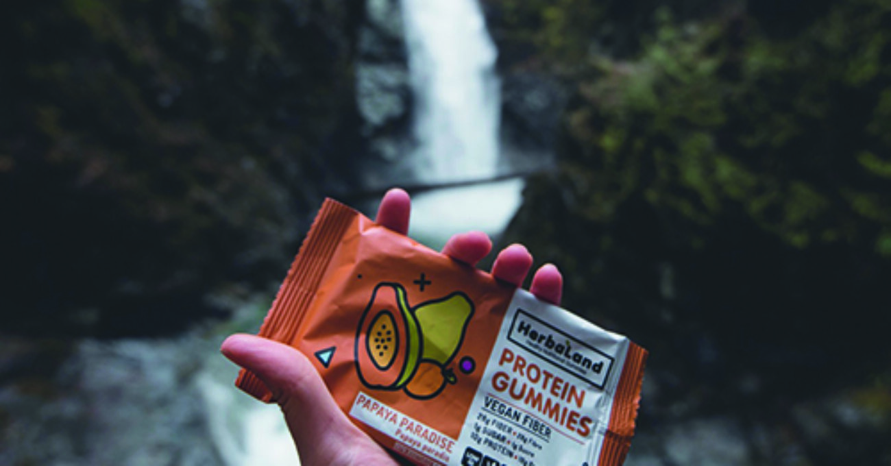
The challenge was to make the products more exciting and fun, as health and wellness products can often come across as clinical and lack energy. By redesigning the logo and consumer packaging goods, I aimed to bring some excitement to being healthy and create a more engaging experience for the consumer.
“Health is key to happiness”, a motto set into the core values of Herbaland
a motto set into the core values of Herbaland


Out with the old

We updated the logo to match the new look and feel of the packaging. Friendly, bold, and confident.
Packaging Redesign
-
Competition: vitality.ca / rainbowlight.com / ollynutrition
Like any rebrand, it starts with the research.
- Competition
- Industry
- Self Discovery
Through this journey, I was able to identify some common themes, issues, and a gap in the market.
Below is a typical example of a health and wellness product line.
From my perspective, the above looked; Dull, clinical, and forgettable.
Then you place this style of health and wellness product on the shelves of a supermarket and you can see the biggest issue.
Above is a typical shelf in North America and the issue noticed by my team and I was that all of these bottles in the health and wellness sector looked the same. They didn’t entice me to buy any, and I struggled to remember any particular one after I left the store.
With all the research done and the gap in the market identified, we moved onto the concept phase to create a brand that was rememberable, fun, and expressive.
Summary
As a Marketing Director and Creative Director for Herbaland Naturals Inc., I was tasked with redesigning the logo and consumer packaging goods for their line of health and wellness products. The challenge was to create a brand identity that stood out in a crowded market while still maintaining a professional and trustworthy image.
Through extensive research and collaboration with the Herbaland team, I was able to develop a new brand strategy that emphasized the fun and enjoyable aspects of being healthy. I worked on redesigning the logo and packaging to create a more visually appealing and playful look that would appeal to their target audience of health-conscious consumers.
The result was a successful brand redesign that helped Herbaland Naturals Inc. stand out from their competitors in the health and wellness industry. My experience in branding and packaging design, as well as my ability to work collaboratively with clients, allowed me to deliver a product that met the client’s needs and exceeded their expectations.
If you’re looking for a creative director who can help you bring excitement and fun to your brand while still maintaining a professional and trustworthy image, I’m the designer for you. Contact me to see how I can help you stand out in your industry and reach your target audience.
Resources


