5 Easy Steps to Help you Find your Brand Content Typefaces for your Business
Read Time: 11 Minutes
Introduction
This blog will help you FIND YOUR BRAND CONTENT TYPEFACES
![]()
But wait! What’s the difference Between Typeface vs font?
It is crucial that we establish a proper understanding of certain terminology before proceeding. Contrary to popular belief, the terms ‘font’ and ‘typeface’ are not interchangeable! A typeface refers to a distinctive design of lettering, whereas a font corresponds to a unique iteration of that typeface. Think about it this way: a typeface is a collection of fonts that share similar stylistic features (Check out the image below for clarification). It’s imperative that we grasp these distinctions in order to communicate effectively within the design industry. Click here to read this beginner’s guide on Typography.
What is a Brand Typeface?
Difference between a Brand Logo & Content Typefaces

What is a Brand Logo Typeface?
You will have one Logo Brand Typeface within your brand identity, as this typeface will represent your brand personality in the form of a logo. Your logo may be or contain a Wordmark or Lettermark; think about brands like Apple, Samsung, Nike, and Macdonalds.
Only use this font in your logo, as it’s not intended for long blocks of text.
It might seem fun to read a book printed in the iconic Coca-Cola font; however, it could quickly turn into an unpleasant and tiring experience. After a few pages, you may start to feel fatigued and frustrated, making it an unpleasant experience overall.
What is a Brand Content Typeface?

Why is a Brand Content Typeface Important to your Business?
The Four Major Typefaces to Consider when Selecting your Brand Content Typeface
Let us become more acquainted with the main font categories: Serif, Sans Serif, Display, and Script.

-
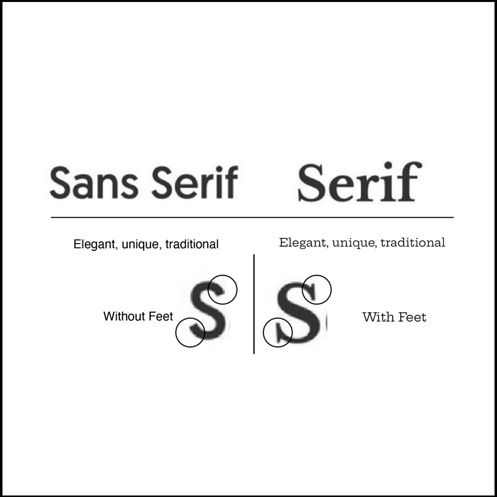
Sans-serif: These typefaces are created without the serifyied edges, giving them a more relaxed and playful appearance. These fonts are particularly well-suited to digital designs.
-
Serifs: These are those little lines you see sticking out from the edges of letters. This type of font is usually considered to be quite formal and traditional, so they work great when designing print work.
-
Handwritten: Text that mimics the appearance of handwriting is referred to as a handwritten font. An example of this often seen in formal written pieces is the use of cursive fonts.
-
Decorative: These fonts are typically characterized as being unique and interesting. They are usually perceived as having a quirky, creative, and playful feel.
Which Typeface Should you use for your Brand Content Typeface Selection?
When selecting the font for your brand’s content, don’t overlook the importance of readability and comprehension. That’s why traditional Sans Serif and Serif fonts are the perfect solutions for you, because they’re proven to make reading effortless and improve cognitive performance.If conveying detailed information is your goal, don’t settle for Decorative or Handwritten fonts because they are best for short headers, Logos, or posters. Instead, opt for San Serif and Serif typefaces that can easily handle a high volume of information. A good Brand Content Typeface has to make an immediate impact and keep your readers engaged – this is where these fonts excel.
Here are Nine tips for choosing a Serif & San Serif for your Brand Content TypefaceS
Below are tips and guidelines that can help you;
-
- When it comes to picking a typeface for your marketing material, choose one with lots of options. Look for font families that come with four or more different weights and styles. That way, you can experiment with various combinations and find the perfect one for your design.
- It’s like a family of six kids – even though each one looks slightly different and comes in various sizes and shapes, they’re still part of the same family. Similarly, a typeface may have multiple fonts, but it’s still seen as one typeface – it’s the collection of all these fonts that make up the typeface.
- When it comes to picking a typeface for your marketing material, choose one with lots of options. Look for font families that come with four or more different weights and styles. That way, you can experiment with various combinations and find the perfect one for your design.
Find your Brand Content Typeface with these 5 Easy Steps
Below is the five easy steps to find your two Brand Content Typefaces that will have your audience feeling something special towards your brand!
Step 1: What is your Brand Personality
- Your Brand Personality is a combination of Brand Archetype & the emotional words that best describe it.
- Write down your Brands Archetype that represents your brand.
- Write three adjectives that best describe your brand’s emotions.
- Write down the Industry you operate in.
- Write down the Sector you sell into, whether business to business or business to consumer (B2B or B2C).

Step 2: Find Inspiration
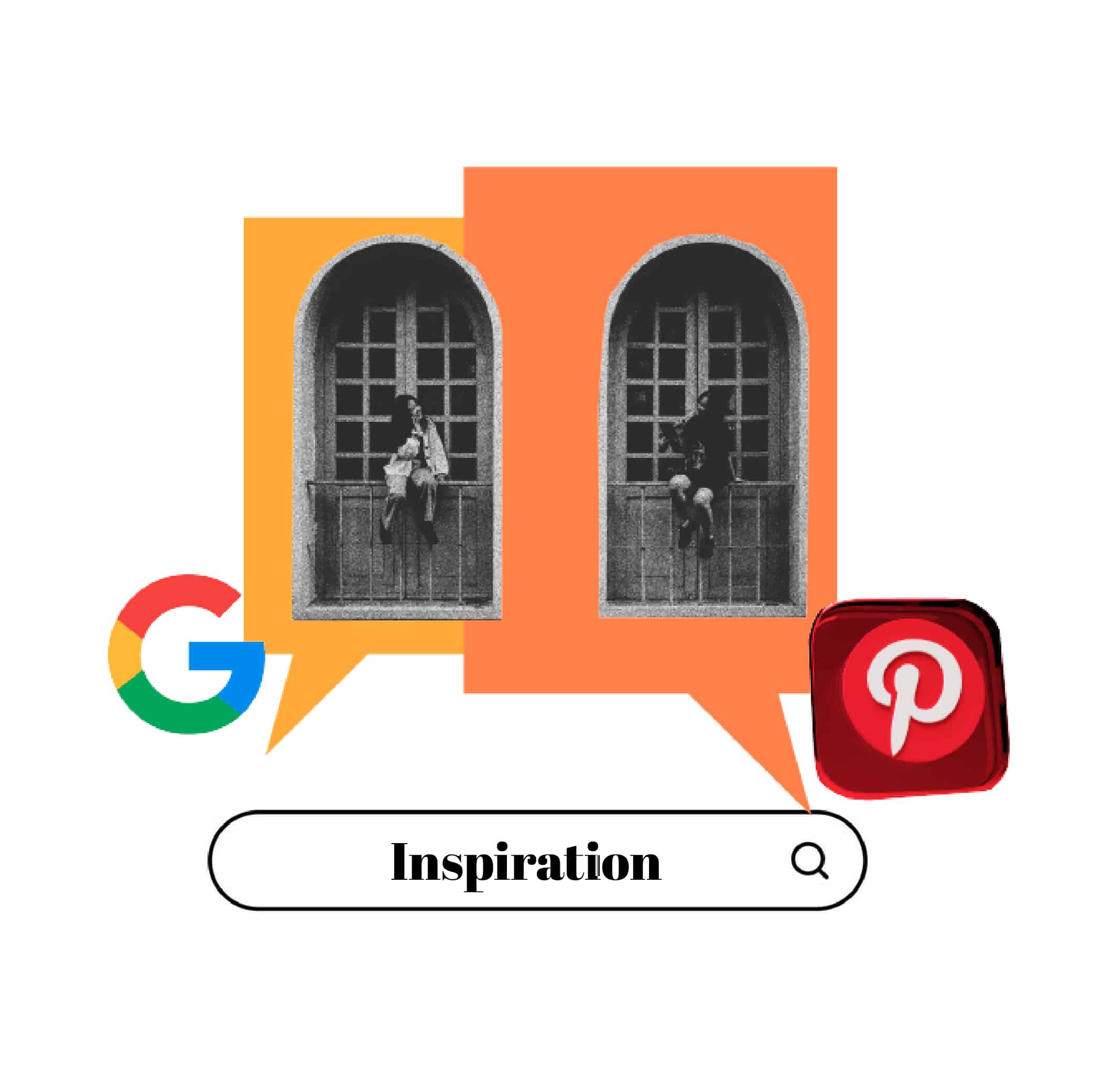
- Just type: “Keyword” Typeface examples into Google & Pinterest to find great inspiration examples.
- Example: Your Industry Typeface examples
- Remember you need two family fonts. One for your TITLE and another for your BODY TEXT.
Step 3: Select your BODY TEXT Font Family
After finding inspiration in Step 2, explore Google Fonts to discover a font that matches your desired style.
- Consider selecting a Sans-Serif typeface for enhanced readability, ideal for body text.
- Ensure the chosen typeface aligns with your brand’s personality and essence.
- Prioritize readability by testing the typeface with longer passages of text.
- Opt for a font family that offers multiple variations for added versatility.
- Take advantage of Google Fonts’ wide range of open-source fonts and icons to seamlessly integrate expressive typography into your global websites and products.


Step 4: Select a Contrasting TITLE Font Family
-
The Typeface you select should keep with the personality and spirit of your brand and contrast well to your BODY TEXT Typeface selection.
- Remember to choose a typeface with multiple fonts within the family.
Step 5: Test your Brand Content Fonts
Key Takeaways
- Typeface refers to a font family, while a font is a member of a typeface.
- A brand should have two typeface categories: Logo Brand Typeface and Content Brand Typeface.
- Sans-serif and Serif typefaces are ideal for readability, especially for large amounts of content.
- The Logo Brand Typeface is the emotional and visual representation of a brand, exclusively used in its logo, and must be legible.
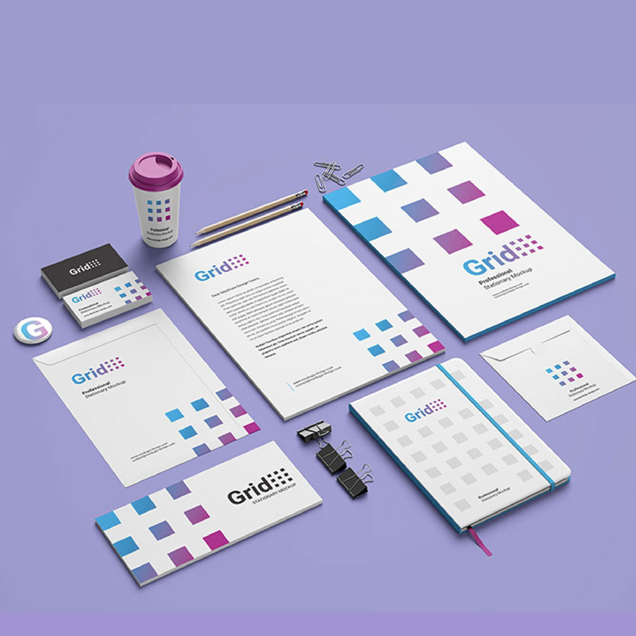
- The Content Brand Typeface is used for all written content produced by a brand, ensuring legibility and readability. It should be consistent across marketing materials, creating a clear and recognizable image that reinforces the brand’s values, personality, and tone of voice.
- A Content Brand Typeface consists of two typefaces: a TITLE typeface and a BODY text typeface. The TITLE typeface should grab attention, while the BODY typeface should be easy to read.
- Select typefaces that reflect your brand identity and personality.
- Choose typefaces with a large family of fonts within them for versatility.
Summary
In conclusion, the importance of selecting the right typeface cannot be overstated. It is an essential part of building a strong brand identity and setting yourself apart from the competition. Your brand’s personality and message can be effectively communicated through the right font. It can grab your audience’s attention, enhance readability, and reinforce your brand’s values, tone, and personality.
However, sourcing the right font can be a challenging task, especially for small business owners with limited resources. But, Google Fonts is an excellent solution for those looking for a free and reliable option. They offer a wide range of typefaces that are compatible with all devices and operating systems, saving you time and money. So, by choosing Google Fonts, you can simplify the process and ensure that your brand identity is consistent and professional across all your marketing materials. Invest in your brand’s success by making the right font choice today!
Works Cited/ Resources
- Amanda Bowman (2021). Use These Powerful Psychology Strategies to Choose Fonts For Your Business. crowdspring.com/
- Belt Creative (2020) Typography 101: How to Choose the Fonts for your Brand. beltcreative.com/
- Cameron Chapman (/). Tips and Considerations When Choosing a Typeface (with Infographic). toptal.com/
- Chris Fulmer (2021). How to Choose the Best Business Fonts for Your Brand. goldenvineyardbranding.com/
- Editorx (/). Never be confused by typefaces vs. fonts again: here’s how they’re different. editorx.com/
- Harshita Arora (2018). How Typography Determines Readability: Serif vs. Sans Serif, and How To Combine Fonts. freecodecamp.org/
- Katie Dooley (/). What is a Brand Font and How Do I Use It? paperlime.ca/
- Kimberly Mak (2022). The 4 main types of fonts & how to choose the right font for your brand and logo. fiverr.com/
- MasterClass (2021). How to Pick a Font for Your Brand: Guide to Choosing Fonts. Masterclass.com/
